

Solar Panel Output Under Various Conditions
In a previous post I talked about how my sensors tell a story regarding our power usage. There are still many more stories that the sensors can tell us about how we use electricity and how much solar power is being generated. Have you ever wondered how the solar power output looks like during the course of a day? Let me give you a hint – it almost looks like a half-rectified sine wave. It was a really interesting discovery. How about the output of solar panel when the day is cloudy? I have answers to all these questions and more in this post.But first let me walk you through the whole setup that I have at home.
A WCS1800 current sensor measures the DC current flowing from the solar charge controller to the batteries. The measurement is taken every second or so using an Arduino nano. The Arduino is connected to a HC05 bluetooth module. The bluetooth module then transmits the collected data wirelessly to an old Android tablet I have lying in the house. The Android tablet uploads the data periodically to Cloud Firestore. I wrote a web frontend which downloads the data from Cloud Firestore and generates graphs to my liking :). If you need to understand more, please check out my previous post on how things are setup.
With that out of the way, let me show you some interesting graphs. So on a sunny day when there is almost no cloud cover, the output of my 320W solar panel when plotted throughout the day looks like the following chart.
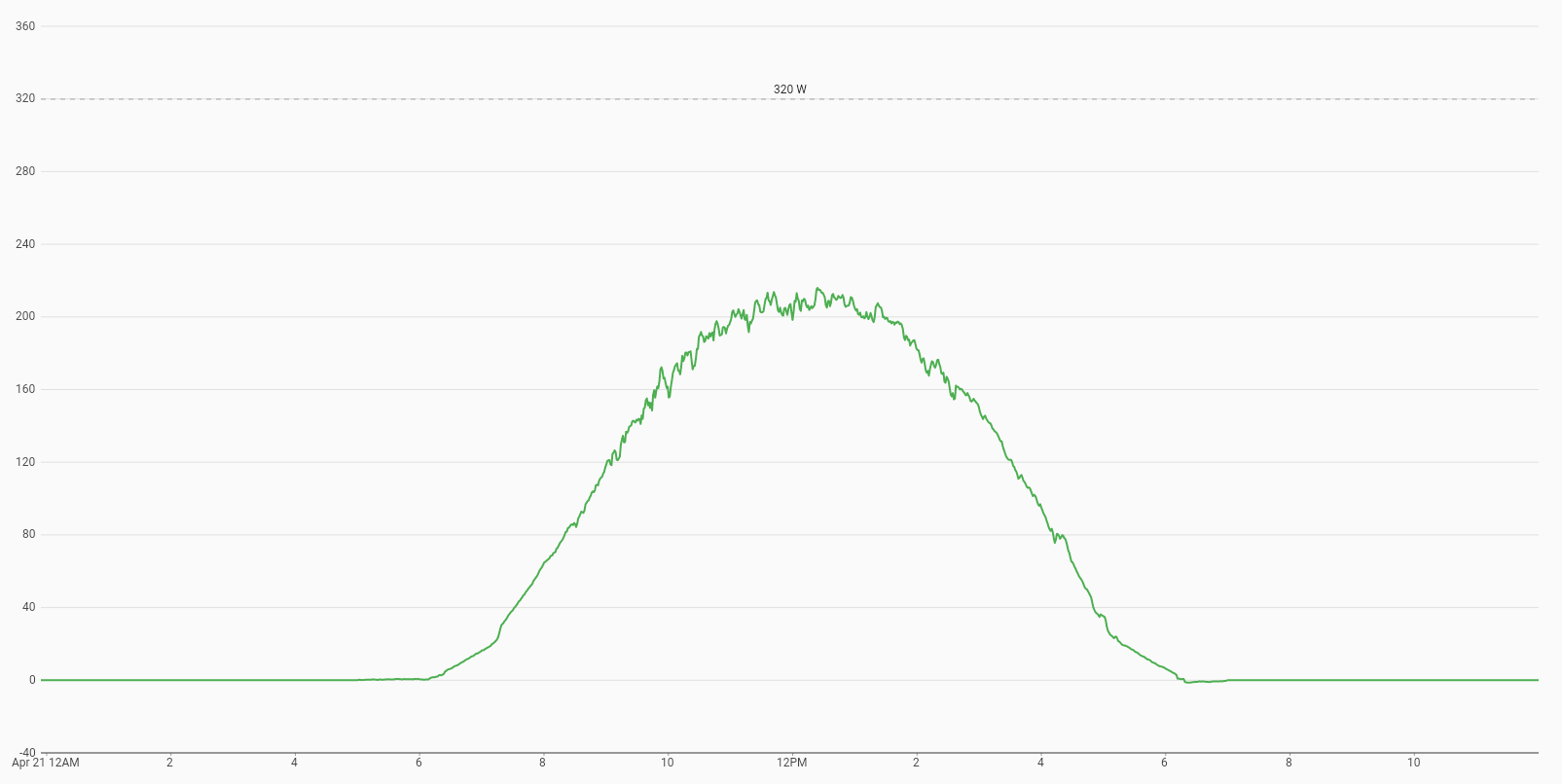
You will notice that the right side of the sine wave falls a bit more steeply than the left side. I am wondering if that is because of some alignment issue of the panel or may be some shade is falling on the panel, although I did not notice any shadow falling on it. This graphs is from Feb 23, 2022 in Bangalore so it is sort of spring time. As a result you will see the solar panel generating power after about 7 am and shuts down around 6 pm. The peak power was about 250W even though I have a 320W panel. In the factory the panel is tested at 1000 W/m2 irradiance and labelled to generate 320W in those ideal conditions. Obviously the spring season sun does not have the 1000 W/m2 irradiance so I am not seeing the 320W peak power.
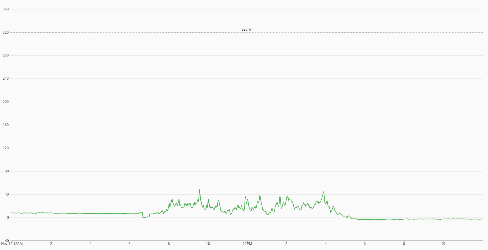
Next chart is on a day when it was very cloudy throughout the day (Nov 12, 2021). You will notice that there is very little energy generated that day. The peak power was 50 W! So remember that if you live in a place that is usually very cloudy, solar panels may not be a good idea.
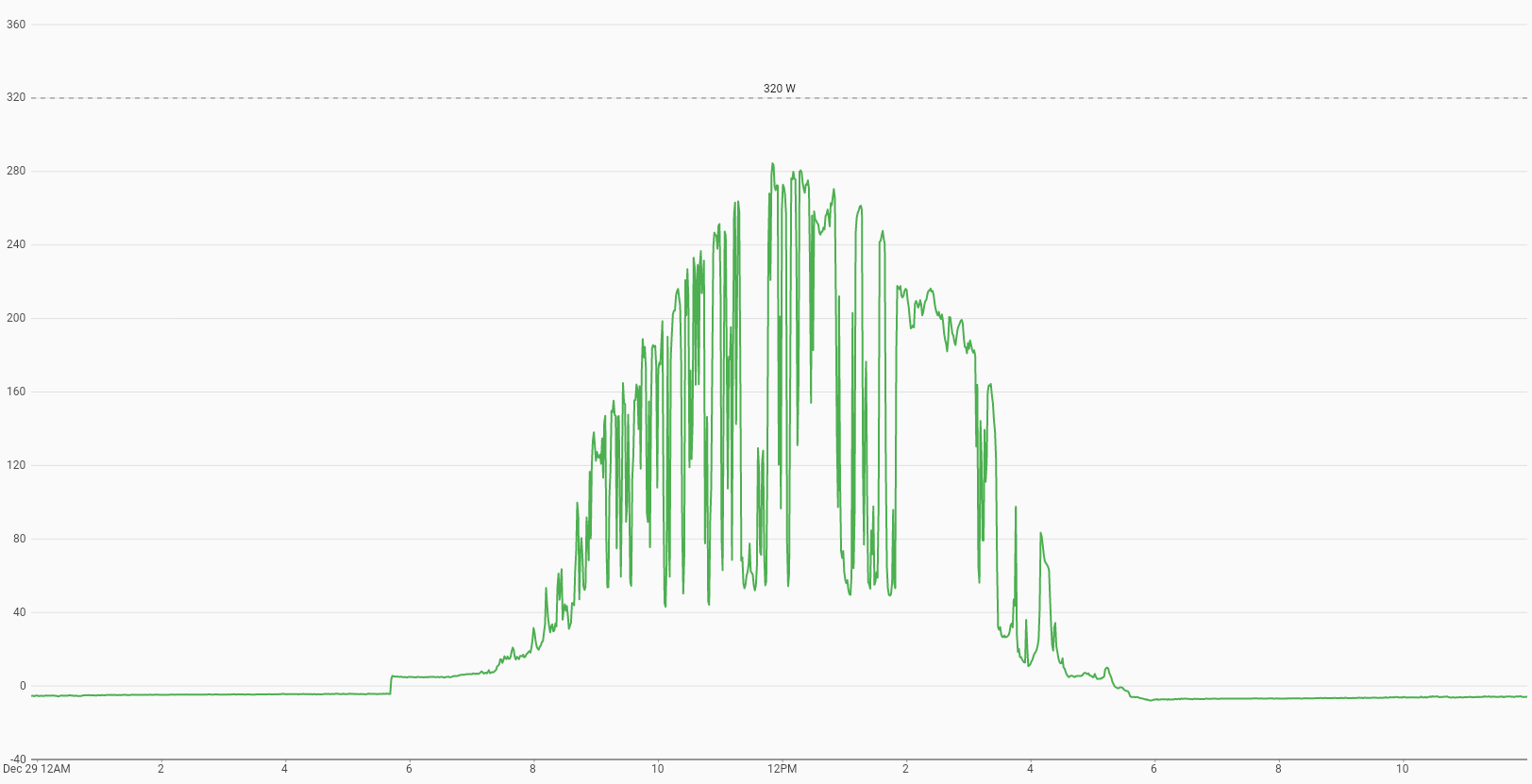
On a moderately cloudy day, the performance is slightly better as you will see below. On this particular day (Dec 29, 2021), there were a lot of moving clouds. So, as and when there are no clouds under the sun, the solar panel was performing normally and when clouds come under there is a drop is power generation.
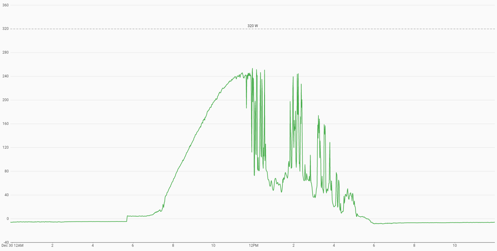
One final graph before we wrap up. It was generated on a day when it was sunny until about afternoon and it suddenly become cloudy after than. So there was a nice smooth sine wave until 12 pm and then the power generation was all over the place.
Hopefully that gives you some idea about how a solar panel will perform during various weather conditions and also throughout the day. I certainly had fun learning about the panel and my solar panel setup.