

Friends Roster – Responsive Layouts
This is the continuation of “how I built the Friends Roster app” saga. If you missed the previous parts in this series, do check them out — part 1, part 2, part 3, part 4, part 5, part 6 and part 7. One of the nice features of Flutter is building responsive layouts is quite simple. It is certainly easier than building responsive layouts in HMTL or Android.
As you already know, the reason I chose Flutter is because I can build for both the web and android from one code base. That means I had to design the UI to adapt to large screens and small screens and everything in between.
Large screens
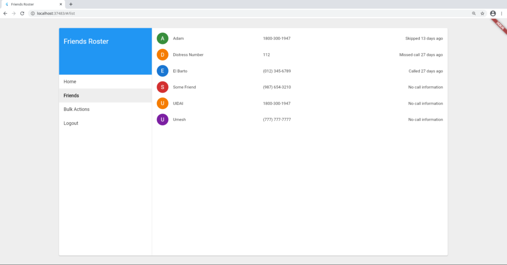
Take the case of a large screen, for example in a desktop browser. There is too much real estate. So limiting the app's UI to a maximum of 1400 pixels reduces the amount of white space in the app. Thankfully Flutter uses device independent pixels, so I don't have to worry about high DPI screens vs low DPI screens.
Medium screens
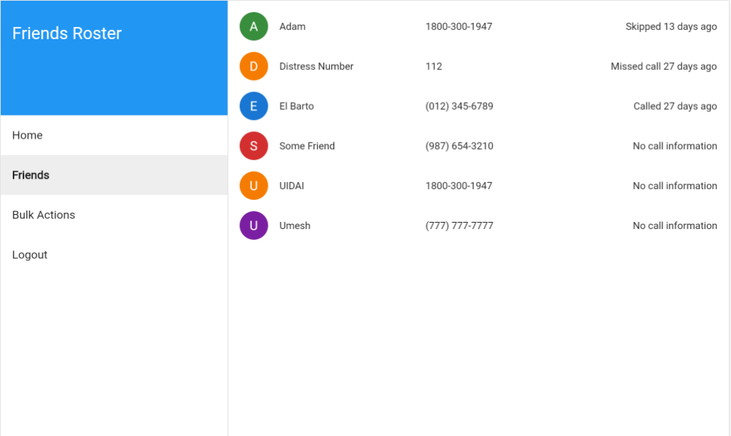
These devices could be tablets on landscape mode or small screen laptops etc. Here, the app fills up all available space.
Small screens
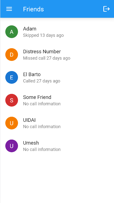
On mobile devices we don't have a lot of horizontal space when the device is held in portrait. So in this case I hide the left navigation panel inside a navigation drawer. To navigate, you will need to click the hamburger menu. Notice also how the list items show the names and call info in a 2 line format laid out vertically. On larger screens they were positioned horizontally.
Layout code
The logic that determines the layout is quite simple.
final screenWidth = MediaQuery.of(context).size.width;
if (screenWidth < 900) {
  return _buildDetails(context);
} else if (screenWidth < 1400) {
  return _buildDrawerAndDetails(context);
} else {
  return Center(
    child: ConstrainedBox(
      constraints: BoxConstraints(maxWidth: 1400),
      child: Card(
        color: Colors.grey.shade100,
        clipBehavior: Clip.antiAlias,
        elevation: 3,
        margin: EdgeInsets.all(32),
        child: _buildDrawerAndDetails(context),
      ),
    ),
  );
}
If the screen width is less than 900 pixels then show only the details content. If the screen is less than 1400 pixels, then show both the drawer and details side by side but take up all the screen space. Finally if none of the constraints apply then make a constrained box with max width of 1400 pixels, decorated with a Card. Then show both drawer and details content inside that box.
Changing density
Sometimes there is not enough horizontal space to show all the information. In that case we can hide some columns of data like friend phone number. Likewise on mobile screens the data is laid out vertically instead of horizontally. This is achieved by showing a ListTile on small screens and a Row on larger screens.
return LayoutBuilder(
  builder: (BuildContext context, BoxConstraints constraints) {
    if (constraints.minWidth < 500) {
      return ListTile(
        onTap: () => _showFriendDetails(),
        leading: _buildAvatar(),
        title: _buildName(),
        subtitle: _buildCallInfo(),
      );
    } else {
      return InkWell(
        onTap: () => _showFriendDetails(),
        child: Padding(
          padding: EdgeInsets.symmetric(horizontal: 16, vertical: 8),
          child: Row(
            children: [
              _buildAvatar(),
              SizedBox(width: 16),
              _buildName(),
              if (constraints.minWidth > 700) _buildPhone(),
              Spacer(),
              _buildCallInfo(),
            ],
          ),
        ),
      );
    }
  },
);
As you will note above, if the screen is larger than 500 but less than 700 pixels then the phone number is not shown to reduce the density.
That is all for today. If I had seen the following video before embarking on my journey, it would have helped me more in building responsive design. Here is the video for future reference.