Where I Struggled With Flutter
In one of my previous posts I mentioned that it was fun and easy to code in Flutter. But that does not mean there were no difficulties. In this post I will cover a couple of areas where I struggled. The post will go into some technical details regarding Flutter and android development. So if you are not interested in them you might not care much. Feel free to skip.
Building the UI
I come from android background and building UI is quite different in Flutter. I actually like the way you write code to build the UI in Flutter instead of declarative xml in android. It helps in improving build speed (hot reload) and also code completion. Where I struggled was with how the widgets would behave. I encountered errors in building a UI several times. Here are some interesting ones.
Always use Scaffold
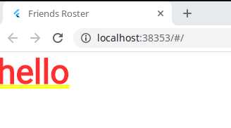
One quirk was that widgets should be placed inside a Scaffold widget. Otherwise the UI looks wrong and I could not understand what was going on initially. This applies to tests as well. For example, building a text widget using just Text('hello') will get you the following UI.

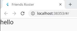
Wrap it with a Scaffold and you get the right UI.
Scaffold(body: Text('hello', style: TextStyle(fontSize: 24),))

Learn the widgets
Like with any new SDK, you better learn the basics before deciding to build a full fledged project. I did not heed the advice. In android, most UIs start with the basic LinearLayout to layout widgets vertically. I found the equivalent in Flutter which was called Column. It was named appropriately. So no problems there. I tried the following code to center align the widgets in a Column.
Scaffold(
  body: Column(
    crossAxisAlignment: CrossAxisAlignment.center,
    children: [
      Text('hello', style: TextStyle(fontSize: 24)),
      Text('world', style: TextStyle(fontSize: 24)),
    ],
  ),
)
Err, that did not work. All the widgets are still left aligned. Perhaps the Column widget was not occupying the whole width of the screen like match_parent in android. Normally in android I would check how much space a widget occupies by using a background color. I know, I know, there are UI inspector tools to get all the dimension and layout details. But I prefer something quick and dirty. Unfortunately there is no color option for the Column widget. With some help from StackOverflow I found out that I need to wrap it in a Container widget. That is a bit annoying. Just to add a background color I need a wrapper?
Anyway after adding a Container and color my suspicion turned out to be true. A Column widget is match_parent vertically and wrap_content horizontally by default. I had many such "you need to learn the basics" moments with Flutter widgets coming from android background. Some other widgets that come to mind include Expanded, Center, Flex, BoxConstraints etc.
Where is the gravity?
Continuing on with my layout issues, I just want the text to be in the top-center. In android I would make the layout_width="match_parent" and then do gravity="center" on the parent widget (Column). Or do layout_width="wrap_content" and layout_gravity="center" on the child widgets (Text). I could not find an equivalent in Flutter.
For example, I can do the equivalent of layout_width="match_parent" on Column using crossAxisAlignment: CrossAxisAlignment.stretch but then there is no way to do gravity="center" because crossAxisAlignment can either be center or stretch but not both. The problem could be solved in many many ways, but the simplest I found was to wrap Column in Center.
Scaffold(
  body: Center(
    child: Column(
      children: [
        Text('hello', style: TextStyle(fontSize: 24)),
        Text('world', style: TextStyle(fontSize: 24)),
      ],
    ),
  ),
)

I can go on and on about these issues (Keys comes to mind), but you probably already get the drift. If you are coming from a different layout system such as android or the web, take some time to learn Flutter widgets. They have a very good and lengthy documentation explaining how widgets work.
Navigator 2.0 is a pain
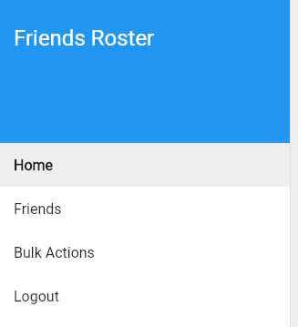
Everyone is used to the navigation drawer and its purpose in navigating the UI. I wanted to add a simple navigation drawer and a few items under it (see picture below). But that has led me down a rabbit hole. Flutter has a new navigation method dubbed 2.0 and it is not straight forward to understand.

I had to write quite a bit of code for something as simple as navigating from one page to another. I guess given that flutter works on Web, Android and iOS from one codebase, this complexity is warranted. It may have helped me if I knew about the following talk on Flutter.
Well that is a wrap on the difficulties I faced with Flutter. In some future post I will write more details about the Friends Roster app.

